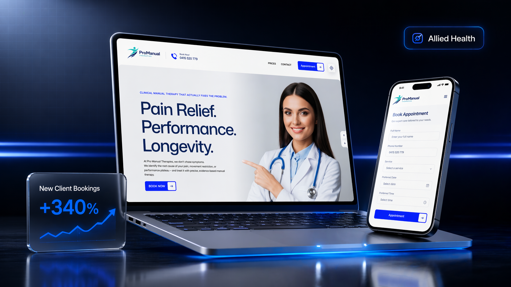
The problem
Pro Manual Therapies had the rarest thing in healthcare: a genuinely differentiated approach. Patients weren't coming to treat a symptom — they were coming to fix the underlying mechanical problem. But their website didn't say that. It looked like every other clinic site: a stock photo of a hand on a shoulder, a list of services, and a contact form buried three clicks deep.
The result? Prospects arrived, couldn't tell why they should book here instead of the chiro two blocks away, and bounced. The clinic's best asset — the way they actually think about bodies — was invisible.
What we did
We didn't start with design. We started with language.
-
Positioning workshop
Three sessions with the clinical team. By the end we had one sentence the entire website would defend: "Clinical manual therapy that actually fixes the problem." It wasn't cute. It was specific. And it immediately filtered out the wrong-fit patients who just wanted a 30-minute rub.
-
Patient-first architecture
We rebuilt the site around the three questions patients actually ask before booking — "What's wrong with me?", "Can you fix it?", "How much?" — in that order. No "Our Story" on the homepage. No team carousel. A direct path to the answer they came for.
-
Trust-led booking flow
Instead of a generic contact form, we built a three-step intake that qualifies the patient, sets expectations, and offers a direct booking. It doubles as a clinical filter — patients self-select into the right first session before anyone picks up a phone.
-
Content that compounds
We mapped the 40 symptoms patients actually search for in South-East QLD and built a structured content system so every search query has a real home. No AI slop. Written with the practitioners, reviewed clinically.
"Pretty" doesn't convert in healthcare. Certainty does. We picked one promise, defended it everywhere, and made the hardest-to-book thing — clinical trust — available in six seconds.
The outcome
Within the first 90 days post-launch, the new site moved from "a digital business card" to the clinic's best-performing acquisition channel. Patients arrived already pre-sold. Intake calls got shorter. No-show rates fell because patients understood what they were booking.
The most telling metric wasn't traffic or even bookings — it was that the front desk stopped answering the same three questions on every call. The website was finally doing its job.
The site stopped being a thing we paid for and started being a thing that paid us. Day one patients are walking in saying things like "your site is the reason I chose you" — and that never happened before.